
Building a product is hard enough. You hire a team, design mockups, get funding, build an MVP, get more funding and then, finally, you release it to the world. And then what happens? Nobody uses it. Urgh. You've got a blockchain UX problem. You're not alone.
In blockchain, this problem is further compounded. On the one hand, you have to work with blockchain tech—which almost everyone finds confusing. On the other hand, your users are having to grapple with new ideas, like private keys, block explorers and dapp browsers just to do seemingly simple tasks. But struggle no more.
We spoke to industry experts and dapp developers who overcame these technical challenges to make some of the industry’s most respected dapps. So get ready to find out how to take your app, dapp, or crypto exchange to the next level.
Blockchain UX rule 1: Get rid of “blockchain”
When you send a WhatsApp message, do you know the tech stack that allows that magic to happen? No. It’s the same with blockchain. Unless you’re building a coding app for developers, keep schtum on what’s going on under the hood.
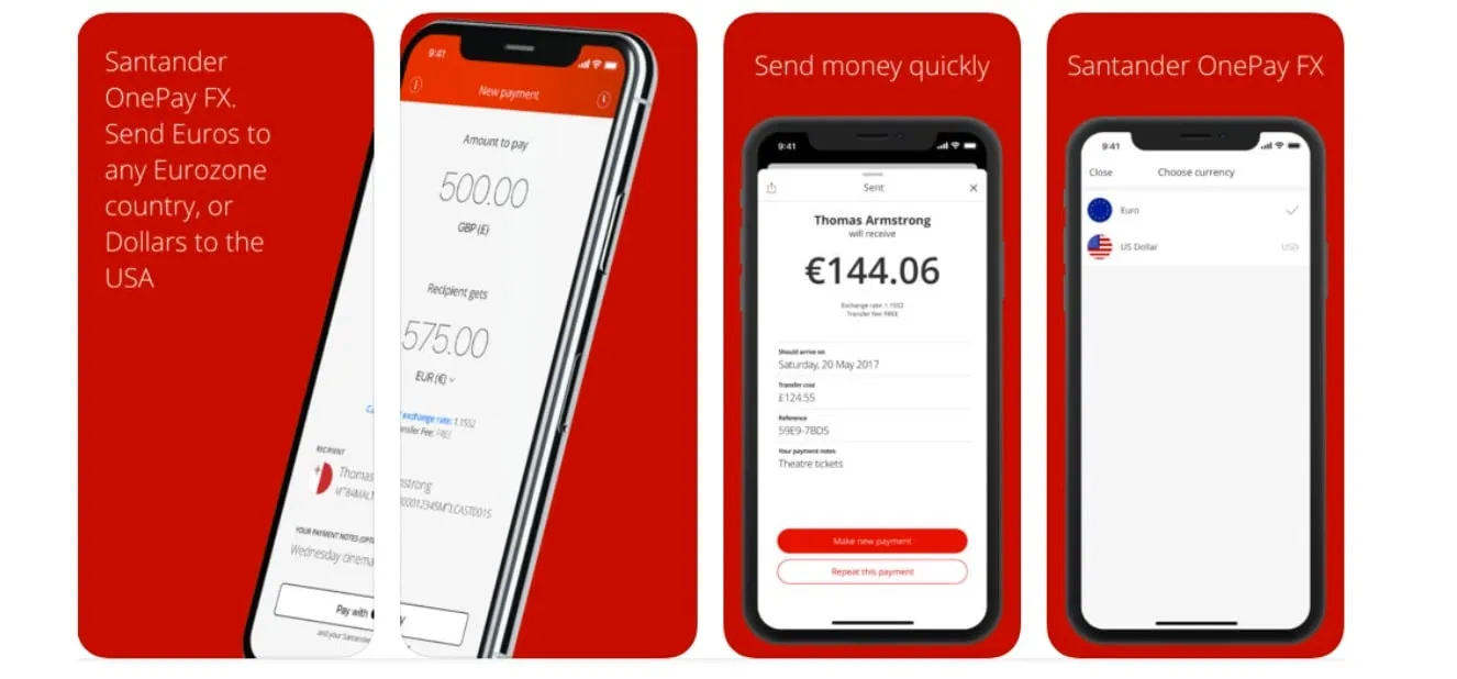
The Santander OnePay FX app does this really well. If you check out its website, notice there’s not a single mention of blockchain, cryptocurrency or even the rather dry distributed ledger technology. In fact, it simply offers a low-cost way to send money internationally. Sure, it is cheaper because it uses blockchain—but users don’t have to know this. So, make sure you get rid of the messy terminology and promote the product purely based on its advantages. If you don't believe us, take a look at what happened to this project.
Amy Ngai, design lead at Dapper Labs (creators of CryptoKitties) has one key tip: you must assume your users are less knowledgeable than you think. She told Decrypt, “We had assumed many of our players knew a lot about crypto and blockchain. In reality, the knowledge of our users was super fragmented. Some knew a lot about speculation and trading but very little about blockchain.”
But it isn’t always that easy to hide the “B” word.
Blockchain UX rule 2: Learn when to show features and when to hide them
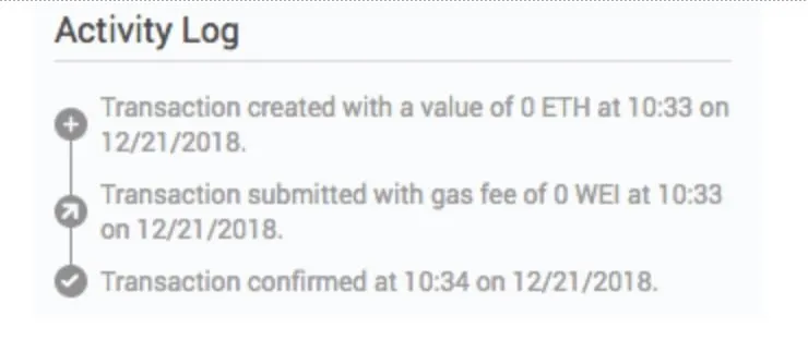
Blockchains are messy things to integrate. They contain a lot of data but it isn’t always easy to present information to users without throwing them in the deep end. Block explorers are a particular pain point. For example, MetaMask—a Google Chrome extension Ethereum wallet—used to send users to a block explorer if they wanted to check the status of their transaction. Understandably, many users got lost and had no idea what they were looking for.
The solution, says Christian Jeria, product design lead at MetaMask was to bring that information in-house and make it public friendly. Jeria says they made the decision to start displaying more of the transaction information within the wallet itself to make it easier for users to see what was going on. Use MetaMask today, and all the transaction activity log lives inside a simple interface, displayed below.
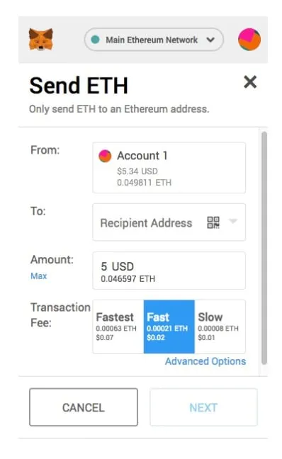
Another bugbear in Ethereum-based dapps is gas fees. This was one of the most common gripes the team at MetaMask heard back from users. Every time you wanted to make a transaction on Ethereum, you had to pay gas fees. While showing gas fees is important to give the user a complete understanding of cost–and to show how slow or long a transaction would take–the way it was presented was too confusing for the average user.
MetaMask managed to solve this issue by providing three simple options (as you can see below). Now, the user has to decide whether they want their transaction to be slow, average or fast, with price estimates on the side. Now, while this isn’t ideal as it still requires extra work on behalf of the user—it is a happy medium between ease of use and providing a more tailor-made service.
Blockchain UX rule 3: Give visual feedback
A blank screen is the quickest way to lose a user. A case in point: While Decrypt was recently reviewing the Bitcoin Lightning Wallet on Android, there was an hour-long wait during set-up. Yet there was no clear way of knowing if anything was going on. All the app had was an “opening” message, but nothing to suggest how long it would take or what was happening under the hood. This was something the team at Meridio discovered.
“We found that the specifics of everything that is happening on-chain is not necessarily relevant to the users, but the ability to see feedback that the transaction is working and track its progress was,” Blythe Meyer, product designer at Meridio—a platform for fractional ownership of real estate—told Decrypt.
We had assumed many of our players knew a lot about crypto and blockchain. In reality, the knowledge of our users was super fragmented. Some knew a lot about speculation and trading but very little about blockchain.
Meridio solved this problem by introducing an animated spinner, indicating that something was in progress. The team took inspiration from apps like Google Drive which use similar indicators. Meyer said, “It’s always important to give users action-oriented feedback, for example, when Google tells you your email has been sent after you click send. With crypto technologies that use smart contracts to complete more complex actions on a user’s behalf, feedback goes from important, to crucial.”
Zach Kalman, product manager at Rimble, which builds dapp tools, added there are many complications when it comes to providing the status of transactions in real time. Kalman told Decrypt, “Providing meaningful, timely feedback to transaction status has been the most common UX challenge we have heard in our research.” For example, when some transactions are being made, it might be fine for the user to continue using the app but other types of transactions might need the user to wait until its finished before they can move on to the next step. Being able to differentiate between the two is important.
Blockchain UX rule 4: Go and ask the last person you'd think would use your app
As a product manager or the CEO, you will know so much more about your product than anybody else. But while you find your product easy to use—it might seem like an impenetrable mess to everyone else. So, the trick here is to get out of your office and find people who have never heard of the product—let alone blockchain technology–to see what they think.
“Five minutes of fresh perspective will open your eyes to something that you never thought would be a point of confusion,” Francisco Inchauste, senior product designer at Meridio, told Decrypt.
Getting user feedback has always been a mainstay in mainstream product launches. But often, a lot of these products involve things that already relate to people—like a new video game or a social media platform. When it comes to decentralized applications, there are so many more pitfalls to fall into. By speaking to everyday people you will avoid them and make a much more appealing product.
Blockchain UX rule 5: Learn to speak your user’s language
Blockchain is a new language for just about everyone, so sometimes it's better to rely on language users already understand, rather than trying to force them to learn the litany of terms and phrases that exist in crypto. Take apps like the original Coinbase wallet. Instead of putting a user's bitcoin balance in crypto terms (e.g. 0.01 BTC), it writes the balance in their native fiat currency. Rather than “cryptocurrencies,” it simply calls them “assets.” These little changes are crucial to your product’s success.
“When most people think of design, they think nice visuals. But design is more about communication, so consider the language that you use in your interface,” says Inchauste, adding, “We have found by adjusting labels and content in the interface it helps users to understand the product.”
And in certain cases, this will be necessary. There are some sticky blockchain issues that have to be made clear. For example, Coinbase wallet tells users not to send Bitcoin Cash to a Bitcoin address—a big problem as it would mean their money is lost. Also, many wallets involve setting users up with private keys that the user must keep safe. Corwin Harrell, senior product designer at Bounties Network—a platform for freelancers—told Decrypt it is “immensely important” for such platforms to provide appropriate context around unfamiliar terms and interactions. If customers lose their money in an app, they won’t be using it again.
Providing meaningful, timely feedback to transaction status has been the most common UX challenge we have heard in our research.
From experience at CryptoKitties, Ngai said that sometimes people will just click something because there’s a big button in the middle of the screen and not read the warning signs—even if the content is about keeping their money safe. Her advice is to, “Ensure that your users are doing the right thing even if they decide to not read the copy.” This means forcing people to check whether they have really written down their mnemonic phrase.
Blockchain is both a blessing and a curse. On the one hand, it enables powerful new applications to be built. On the other, it can create challenging obstacles for you to make things easy for your users. But if you want to become the next Apple—or the next Coinbase—then you need to make a product that your grandparents would be able to master.