

The bitcoin community is trying its hand at design.
Discussion over which symbol should be used to represent the satoshi—the smallest unit of bitcoin, named after its inventor, Satoshi Nakamoto—has resurfaced. After a lengthy Reddit discussion back in March, and many proposed posts since, the issue is once again back on the agenda.
Jack Dorsey, Square’s co-founder retweeted a post by Desiree Dickerson, head of operations at Lightning Labs, asking for a satoshi symbol to be crowdsourced. And, as expected the suggestions rolled in. The problem? None of them were any good.
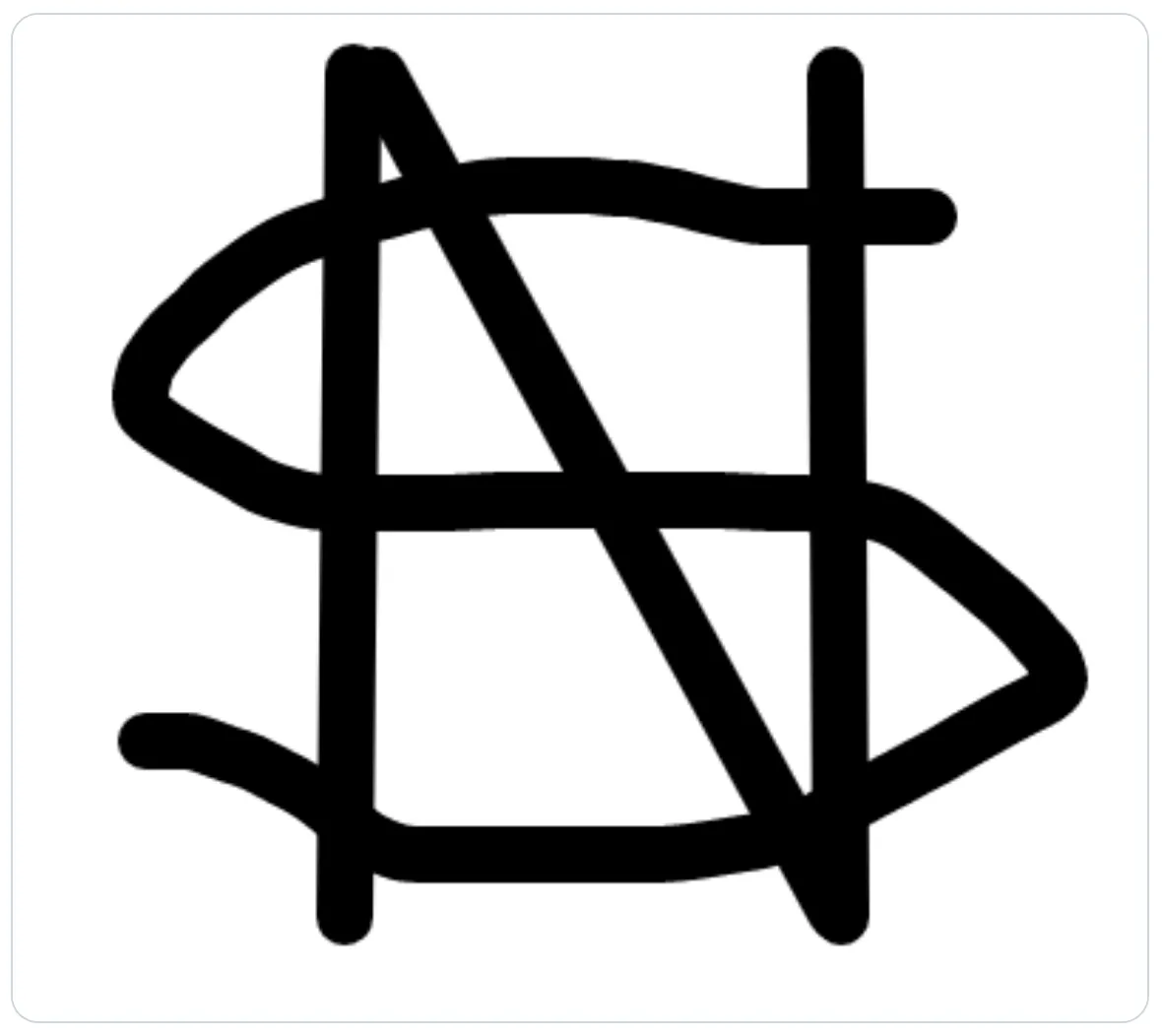
One suggestion was an S written over as N, which was accompanied with a quick mock up:
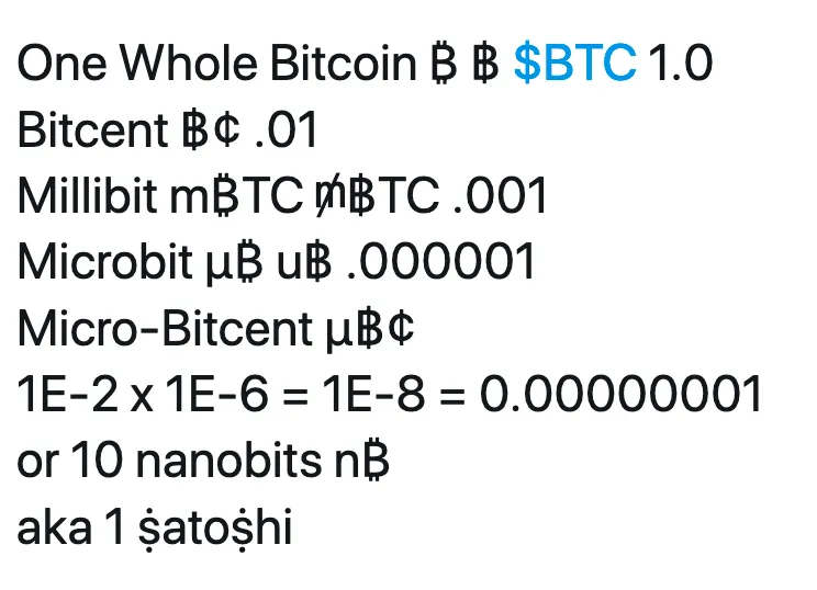
Another idea was to delineate bitcoin (worth $9,580) and the satoshi (worth $0.000095) with almost indistinguishable symbols: ฿ and ₿. With the prevalence of fat-fingered mistakes, this might be a recipe for disaster.
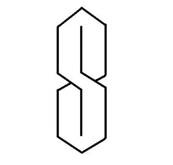
Then there was this suggestion:
We’ll just leave that one there.
Back on Twitter, one Twitter user recommended the Japanese word for Satoshi: サトシ and another put forward an S with a sword going through it. Over on Reddit, the whole debacle was parodied in the Buttcoin subreddit, with the proposed logo people seemed to enjoy the most spelling SFYL, meaning “sorry for your loss”—a term used when someone loses a huge amount of bitcoin in a scam, or a Ponzi scheme or on BitMEX.
One of the most common responses was the “pointy S” that every kid learns how to draw in school but nobody has a clue to where it came from. But alas, it was deemed impractical.
Ken Shirriff, who was responsible for getting the ₿ added to Unicode, strongly recommended that the community sticks to symbols already within the existing batch of approved symbols. “While it's fun to invent a new character for the satoshi, it would be mostly unusable and cause problems,” he tweeted. Instead, he put forward a number of options, including such radical designs as a box with two lines coming out of the top and a line with two intersecting lines.
Several members of the community suggested the lightning bolt, which is used in reference to Lightning—a scaling solution for the Bitcoin network. Yet one beady-eyed watcher pointed out that was the same symbol used by the SS in Germany.
In fact, the only design that appeared to be gathering any sort of momentum was the “Sat”—a mismatch of the @ symbol, the letter S and a line. It looks like this:
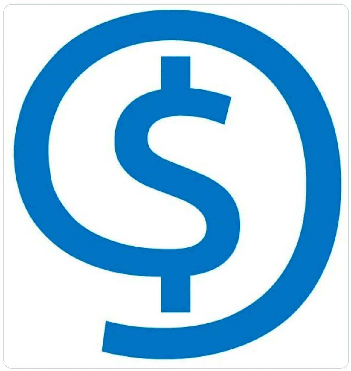
And in practice it would be spelled “$@.” It even has its own Github repo, and its creator has been pushing the design for over a year now.
But alas, Twitter did not take kindly to it, with one user saying, “No offence, but that logo is really ugly.” Another simply said “meh.”
Many die-hard bitcoiners said that the search for a new symbol was futile. In fact, many suggested they should just use the US dollar symbol once bitcoin becomes the world’s dominant currency. The search for a satoshi logo continues.
The one saving grace in all this appears to be the bitcoin community is following a similar pattern to how it choose the B symbol. The original design for the Bitcoin “B” started life as a “BC” on a gaudy gold coin. The final design—the italicised white B in serif with two lines running through it on an orange background—was posted by a still-unknown user as his/her one and only BitcoinTalk forum post in November, 2010, and then just stuck. But it is widely disliked.
The Bitcoinsymbol.org website criticizes it as a logo, not a symbol. As such, it would suit a company better than a decentralized currency. It pointed out that there was no symbol for the B at the time—although it has since been introduced to Unicode and various platforms. Instead, it recommends a “Ƀ” with a dash through the lower section.
Will the satoshi symbol be prettier and more functional, or just another tacky eyesore?